


Studies have shown that you have less than one second to persuade a new visitor to stay on your website, so it’s important that you make a good first impression. Here are 3 common DIY web design mistakes to avoid!
Too Many Fonts
With so many to choose from, it’s easy to get carried away and use lots of different or conflicting font styles on your website – this will be one of the tell-tale signs that it wasn’t professionally designed.
Most DIY website providers, such as WordPress and Wix, come with WYSIWYG (what you see is what you get) content editors that allow users to select and apply various font styles and formats, such as typeface and colour, when making updates to a web page, blog post or product description.
This sounds like a good thing, but the danger of traditional WYSIWYG editors is that they can offer too much control over design. Users are given so much freedom with the customisation of pages and articles, that they can risk damaging the website’s overall image and messaging.
So, if you’re going to have lots of people with differing levels of web design experience working on your website, you may be better off choosing a CMS that allows you to specify how the elements should appear, and can handle predetermined font styles.
Most web designers would recommend you pick just two (three maximum) font styles for your website; one which can be bolder or slightly more decorative for your headings and titles, and a second for the bulk of your body copy, which should be more minimalistic and easy to read. It’s also important to make sure they are web/browser friendly and work well with the one used in your logo.
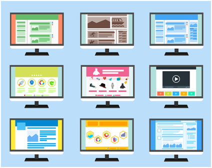
(https://pixabay.com/en/website-page-template-internet-web-1624028/)
Poor Photography
The best way to show your visitors what your business is all about is to use authentic photography, so ditch the cheesy stock imagery and use your own photos instead.
It’s still important to make sure that your images look professional, so those you’ve taken on your nan’s camera phone just aren’t going to cut it. Photos that are pixelated, blurry or out of focus are going to give your audience the impression that you’re not a serious business, while polished, professional looking images will help you to appear established and adept.
The good news is that you really don’t need to be a professional photographer to take fabulous pics. Check out this post from Wix for some tips on achieving great images for your website.
Too Much Text
Most visitors that land on your website will not want to read reams and reams of text. Instead, they will be looking to scan content quickly to get an overview before deciding whether or not to read in full. Having large chunks of text on the page will make that difficult.
While we encourage you to get as much text as possible onto your website for SEO reasons (between 400 and 1,000 words per page), if it is poorly laid out, hard to read and offers no rest for the eyes, it will only cause the traffic that does come in to bounce.
Instead, break content up into paragraphs with headings, and format using different font sizes and colours (while bearing point 1 in mind!). You can also use images and other elements to make the page more visually appealing.
If the above sounds all too daunting, why not involve a professional designer to help you such as MA Design, web design agency (Cheltenham).